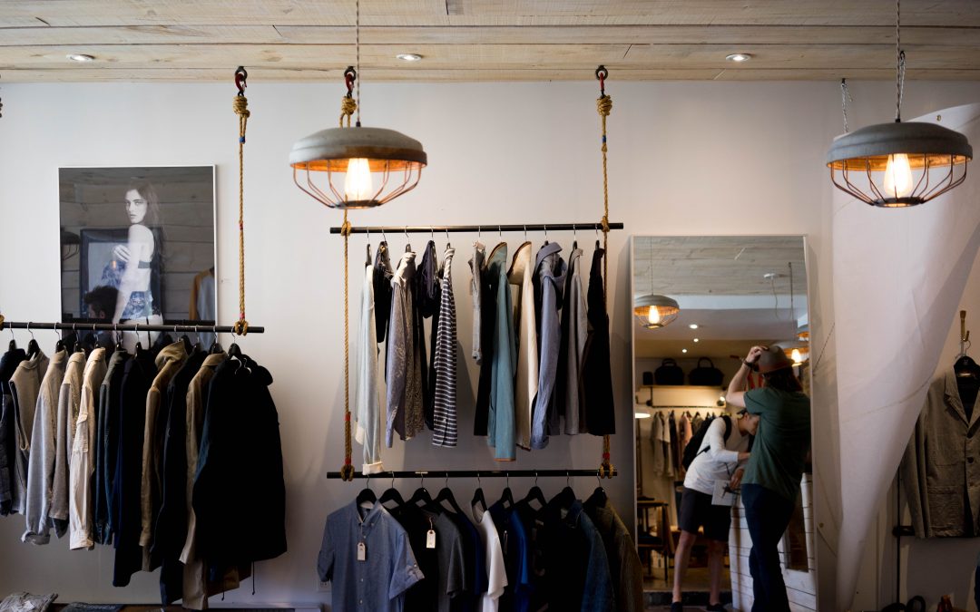
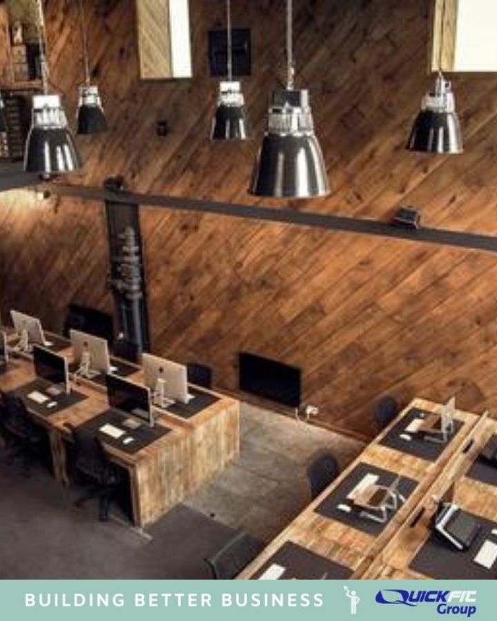
In our last post we looked at the idea of the minimalist shop front. In this post we look at how achieving the minimalist look in your shop design has numerous benefits. These include less stress, less maintenance, more visual appeal and brand clarity. We guide you through what these benefits mean to you and offer you some key tips to achieve the look yourself.
Benefits of a Minimalist Shop Design
Take a look at some of the benefits of achieving the minimalist look in more detail:
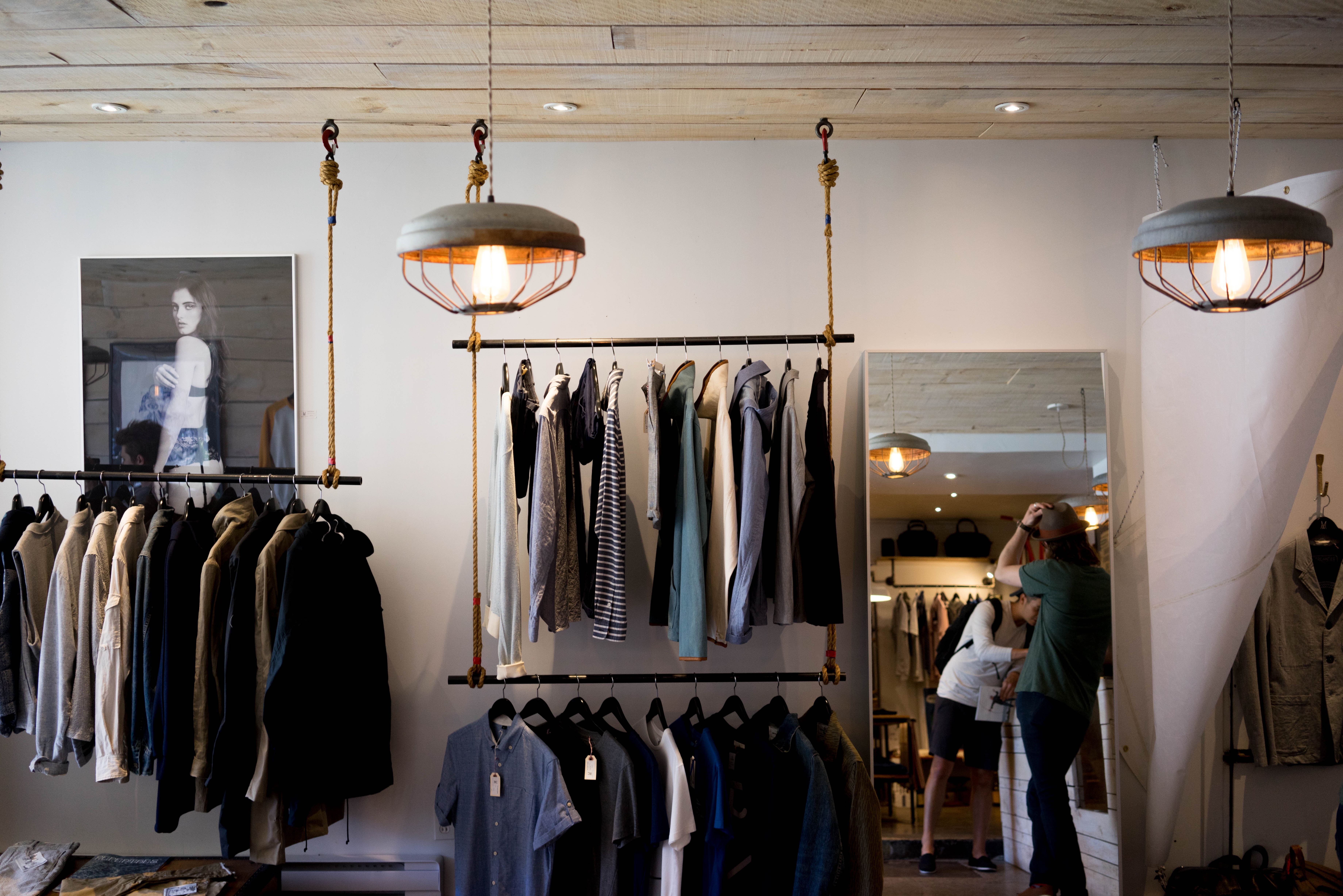
1. Less Stress
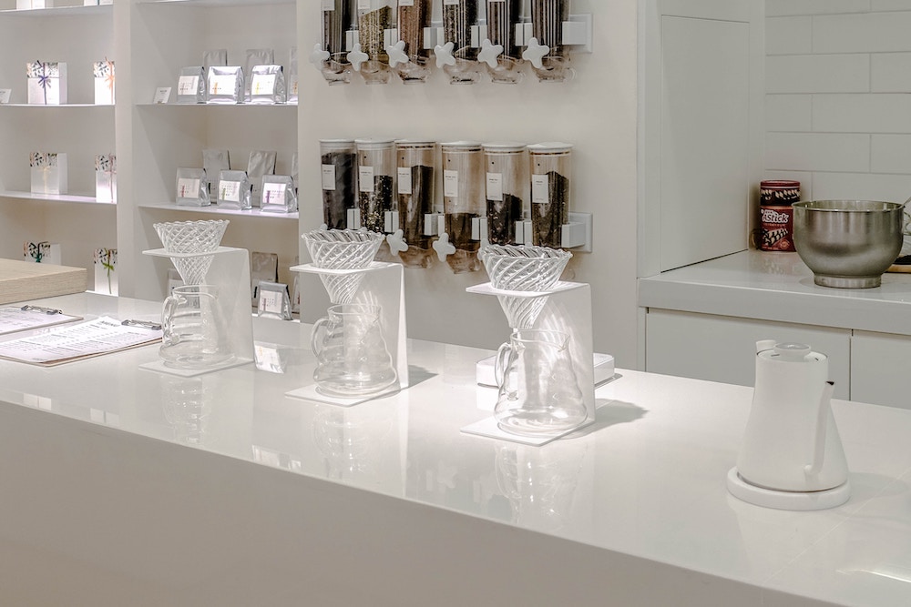
As I mentioned in our last post, having minimal design in your shop instead of loud or overwhelming design is less likely to induce visual stress to your customers. Having no visual distraction means that they can comfortably focus on what they came into your store to do – shop!
The clean and fresh atmosphere of a minimalist shop also has a calming and relaxing effect. Since minimalist designs tend to utilise eye-friendly colours such as muted pastels, earth tones such as beige, creams, tans and soft greys, it stimulates less eye strain and convinces your shoppers to feel more at ease and relaxed as they do their shopping.
2. More Appealing
Minimalist designs also tend to look more chic, refined and luxurious. Perhaps due to the polished manner of decorating and presenting your products, it comes off as an added value making it more appealing to the eyes of your consumers.
Since you will be working with a limited colour palette of around 2 to 3 complementing colours, coordinating designs to have a more cohesive visual aesthetic also adds to the allure of your shop. Not to mention that each piece you feature in your shop can easily complement that of the other pieces since it follows a prescribed colour theme.
3. Easier to Maintain
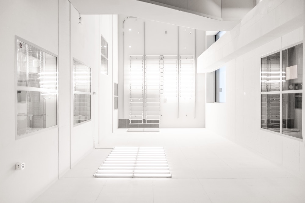
Technically, shops that practice minimalism are easier to maintain since there is actually less furniture and decorations to clean (win!).
So keeping your shop clean and tidy won’t be as much of a task than it usually is if you have an overstuffed space.
Also, it will be easier to spot areas that need to be repaired or address the reparation of broken fixtures and machinery since they will be more visible and exposed to the eye.
4. Easily Reflects Store Branding
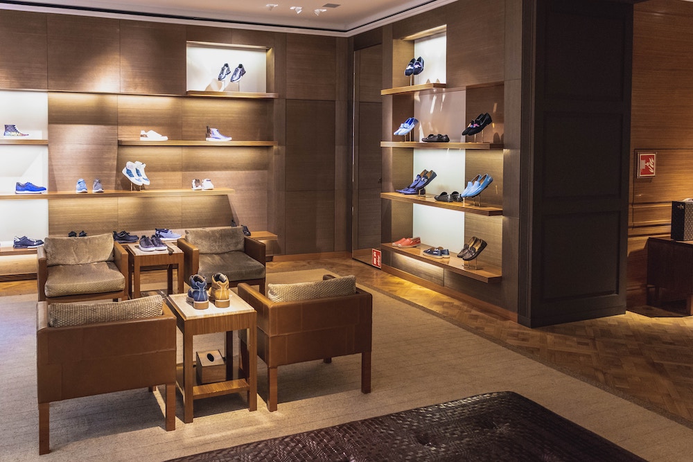
Investing in colours, artworks and other instruments that reflect your store branding will also be one of the main benefits of having a minimalistic shop design. Since you will be featuring only a select assortment of décor and design ideas, it will be easier to coordinate these elements to reflect your shop’s branding.
Tips in Minimalism in Shop Design
Although minimalism follows three basic rules –declutter, organise and store – it can still be quite overwhelming if you are only beginning to subscribe to the idea. So, if you’ve made it this far, firstly well done and let me reward you with some tips to consider when designing a minimalistic shop:
- Invest in Minimal Furniture
As much as possible, limit the amount of huge bulky furniture within your shop. If a particular fixture can be used multi-purposefully, then invest in those instead. Some multipurpose furniture is built-in cabinetry that double as walls or floor-to-ceiling mirrors, tables that have internal storage, stairs that can function as shelves, and other furniture with can be used in many ways. Investing in this type of furniture does not only help you save up on space, but it is also a good way to cut on the costs of having to purchase multiple sets of fixtures.
- Clear your floors, walls and shelves
The next step is to clear your floors, walls or shelves of any unnecessary elements. Go for walls with simple muted colours and avoid patterned wall papers or loud colours as much as you can. If you don’t want your walls to appear too bland, then you can invest in glossy or matte version of these subdued colour paints.
You don’t want to over-stuff your shelves as well. You want them to appear clean and organised and if that means keeping some of your stocks in storage then so be it. A customer can always ask if you have stock of an item anyway. Just make sure that your shelves are always well-organised.
As for your floors, there is no need to invest in rugs, lino, or carpets. Just make sure your floors are free of any debris and are polished into perfection then you’re good to go. Also, make sure that there are no items stacked on the floors to keep it well-maintained. The only things that should be touching your floor are tables, shelves, racks and cabinetry. All other clutter should be moved to storage.
- Feature Accent Decorations
Having a minimalist shop doesn’t mean that you won’t invest in decorations. Of course, you can still feature decorative materials in your shop. However, choose decorations that won’t steal the show. Simple accent decorations such as a painting with the same color scheme as your brand, a simple crystal chandelier, a vase with simple flowers, or an ornate piece in a strategic key position in your shop can simply do the trick.
- Keep it Simple and Clean
Lastly, the main precept to remember when going for a minimalist shop design is to keep things simple and clean. Invest in pieces and design ideas that don’t steal the limelight from your products but rather promote them. Follow simple colour schemes that can be found within complementing or the same colour family than experiment on which colours work well together. Make sure that each and every piece found in your shop has a purpose and that purpose is to guide your shoppers into having not only an immersive shopping experience but also one that is calming and relaxing as well.
So, if you are looking into renovating or redecorating your space towards a more minimalist atmosphere, please don’t hesitate to reach out to our team here at Quickfit and we will be more than happy to assist you re-orient your shop towards a more efficient and simple shop design. Give us a call on 1300 95 94 93.

